Flashback Post
When you are deciding on a design, how do you do it? Do you place the choices together and then carefully compare before you bring other options into the mix?

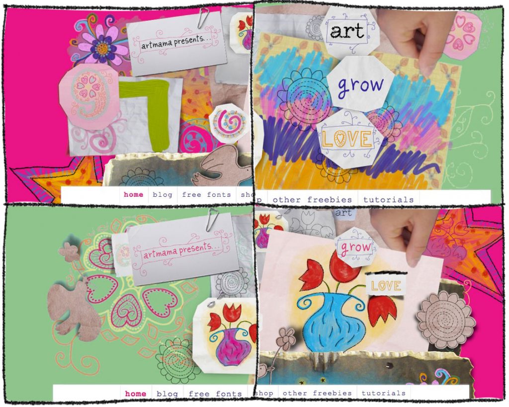
Backgrounds of pink and green mixed up in order to compare different elements
Do you have a list of criteria or design elements that the new art work must include, and go about methodically checking them off or do you let your heart speak for you?

Two versions of the pink background – should I hide most of the muddle as I have in the second one?
Do you choose according to the most dominant colour, or would neatness and symmetry win over all else? Do you like clean, or do you like chaos?
Do you pick one design, then carefully pick apart the details – using a process of elimination according to one less-preferred design element?
When I chose the final design for the background image of my old design website, I looked for colour selections from my own palette, inspired by my design website at urgentartwork.co.nz, and with a slightly messy but inspiring-to-do “look”. I wanted to include a couple of recurring motifs in every background which are mine and have always been a part of my creativity.

The first recurring motif from my life is the vase of flowers (usually tulips), which I have reused in various forms over the years including as dingbats in my julesgirltalk fonts, as artworks from my Food for the Soul series, as illustrations in my home-made gift books, and as a mosaic in my garden. There are several versions of the vase, but the original was based on a vase my mother made and glazed, which I claimed.
The second recurring motif is a dove bearing a flower rather than an olive branch. This is something I have used to represent the legacy we all have an opportunity to leave. My daughter and I came up with a board game a few years ago called Legacy where you moved through life making various choices which lead you towards the kind of legacy you left the world, depending on the number of points you acquired from the choices you made or events which happened to you (turning points) in the course of the game. It was a fun game and not nearly as preachy as it sounds. As well as using the dove motif in my boardgame, Legacy, I have also used it as a mosaic in my garden and in my fonts, and in various other creative projects.
But back to the design decision? What influences you when you choose a design? And out of the designs I have offered above, which would you choose as a background for my this website. To see them all as larger images, please see them on this pinterest board.
This blogpost was originally published in October 2012